Tuesday, 6 November 2012

Paul Rand


Paul Rand is an influential graphic designer, most of his work were logo designs, most of which are iconic and still used, or based upon logos in the 21st century.


As a graphic designer logos or symbols could quite possibly be a task which I would have to do. When looking at other logos already created, I have realised the most successful and iconic designs are by Paul Rand, they are not over complicated, and are easy to remember. I use this concept not only in logo design but all other aspects of my work. This shows Rand's work has lead me to create meaningful simplistic logos.

Before studying Paul Rands work, I struggled creating a graphic with meaning which had to be versatile as an image, to be used big or small on different things. I noticed most of his logos only had one colour and white or black, or a maximum of a few colours to add the greatest impact. I have used this idea in my work, until more colours are needed.

One of his logos I most like is the IBM logo, while at a glance it is simply the letters of the name, with closer study the lines represent the up close lines on a computer screen, which at the time of creation was a great idea. Using little parts of the object or company the logo is representing allows the logo to be simple while portray a tiny bit of information. The perfect logo. 

Wassily Kandinsky - Artist


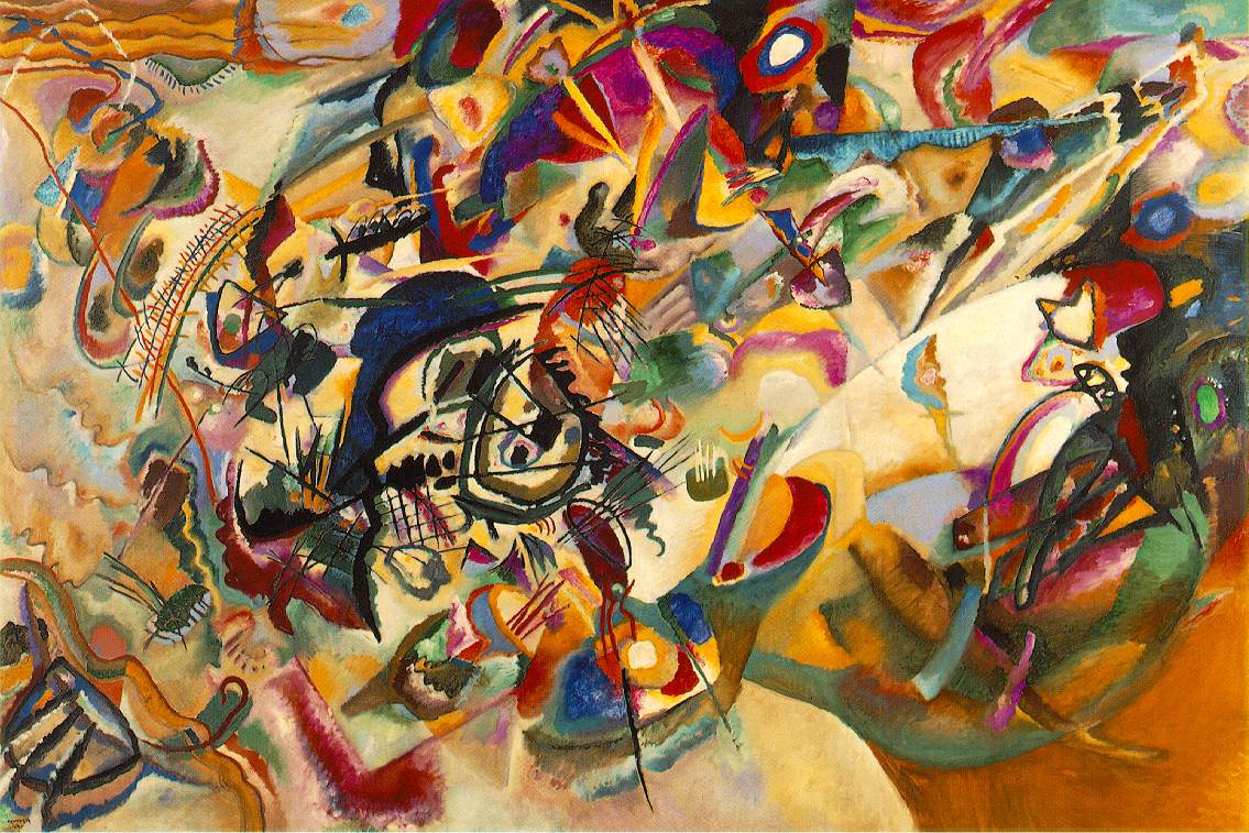
I find Kandinsky the artist influential due to the amount of colours he uses in his paintings. Although normally he uses a lot of colours in his work, I can see the main colours he uses. When doing my work I want to always pick out a colour palette which fits the brief and also looks good. 

However when using photographs in my work, whether it's magazine design or a poster, they will have loads of different colours in them. When looking for a colour scheme for the rest of the design, I will need to pick out colours in the photographs which link well with everything. When looking at kandinsky's work, I can normally see that the main colour palette can take over the over colours due to the way he has added them to abstraction and abstract paintings.

Although Kandinsky has the complete opposite idea of communicating something as best as possible in his work, I feel that he still used colours to express mood and different objects which is what I sometimes use in my work.

Composition 7
Composition 4


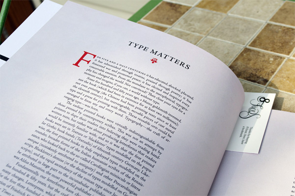
8 Faces Magazine

8 Faces Magazine is a high quality magazine devoted to typography. The layout of the magazine is carefully designed to enhance the typography that is included inside. The designer uses space as a part of each page. Due to my interest in editorial design, 8 Pages magazine is a large influence when considering a layout.

The magazine includes new and old styles in its choice of fonts and layouts. This adds character to the work.


Sunday, 4 November 2012

Andy Warhol Coke


Pieces of Andy Warhol's 'Coke' Work, which was made using a screen printing process has impacted as a piece of advertising even if it was not directly made to be a piece of advertising. Warhol's work has always been controversial true to his mockery of new media.  In this piece of work, the process of screen printing has meant that a simple colour palette is more of a 'must have' than a choice, however, I think he uses this to his advantage. When designing I find a simple design has more impact than a busy design. It means that the audience to the work has less to focus on, but still gets the message in their head. The Coca Cola logo and three iconic glass coke bottles is enough for people to think about coke, and therefore wanting to buy.
   Although Warhol may of been mocking the growth of advertising when creating this piece of work I still see it as advertising and I think the concept behind the aesthetic appeal has been influential to me and also other art-workers who work within the advertising industry.

Josef Muller Brockmann

Josef Muller Brockmann's approach on design has been used in aspects of my work. He simplifies design to its key aspects, not over complicating design. Examples of this is using just text and sometimes images in his work without decoration to keep it free of distraction. He uses white space in his work so that the person observing his work can differentiate parts of his work. In my work I also use space as a part of design to help communicate the information I'm trying to portray.
 
Although Muller Brockmann tends to keep to one typeface on each piece of work, I do like to keep the amount of typefaces to a minimum in my work, only using more if necessary for the design. This may of been influenced by Muller Brockmann's work when looking at Swiss graphic design.

He also keeps a simple colour palette in all his work even when using photographs, the colours seem to only be used to help communicate the idea or information. Although not directly influenced I like using a small palette of colours in my work to keep it aesthetically attractive and un-distractive.

Work using Akzidenz Grotesk

Saturday, 27 October 2012

Artists Statement

   As a graphic designer, moving to London over a year ago allowed me to expand my cultural infuences. As London has got creative history and culture I found myself adsorbed by so many different artists, photographers and illustrators, many using the format of graffiti to express their ideas. Before I moved to London I studied a btec in graphic design at Fareham College which gave me the fundamental skills in creating pieces of artwork from ideas and also giving me computer skills in specific software programs such as photoshop, illustrator and indesign.

  My style of work within graphic design has influences from swiss graphic designers such a Josef Muller Brockmann and also people her were influenced by that such as American graphic designer, Paul Rand. Brockmann's use of simple grid layouts, reduced amount of typefaces used has allowed me to realised that simplicity is key when trying to communicate a message through graphic design. Paul Rand is an influence to me when designing Logos, his reduction of images to create iconic logos has taught me that logos should be easy on the eye.

  I also have interest in photography. This includes both film and digital, I mainly enjoy street photography and also like to document trips and events through photography. Fred Herzog is a photographer which concentrates mainly on street photography. He influences me in this because his approach is to take pictures of everyday events on the street while each image he publishes has its own story which I feel is a key aspect to a photograph.

   I am well aware that graphic design is a fast moving industry due to new technologies such a mobile devices, computers and tablets. This has meant design has become more than designing magazine layouts and posters. However in the future I want to keep book and magazine in my sights. This is because I have interest in printed mediums that cannot be represented perfected on a screen. I want to expand my skills so that if given a brief for 'app' design or web design I would be able to do this. After university I want to work for a design agency which concentrates on a similar style to my own so that I can further expand my knowledge and creative mind.

Brand me up Buttercup - Logo Design

Gallery Website Design